The story behind the C'est du nanan logo
The logo of C’est du nanan embodies the dedication and passion that define our confectionery shop. Since our founding in 2009, we have been committed to creating sweets that honor Japan’s traditional culture while embracing modern creativity. This logo represents the very spirit of who we are.
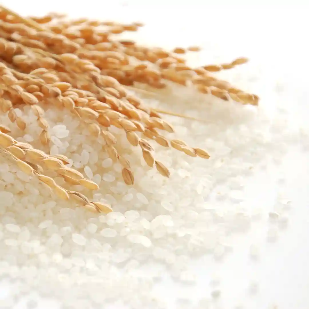
The design combines two elements: Wachigai Usagi (Intersecting Rabbits), created by the renowned Edo-period ukiyo-e artist Katsushika Hokusai at the age of 65, and Dakine Mon (Bundle of Rice Stalks Crest), symbolizing rice, the primary ingredient in our sweets. The Dakine Mon has long been a revered motif in Japan, representing rice—a plant deeply tied to the lives of Japanese people. It has been used as the emblem of Inari and Kumano shrines, as well as among Shinto priests and parishioners. Through this crest, we express our respect for Japan’s rich culinary traditions and cultural heritage, reflected in our rice flour-based confections.
Additionally, we incorporated a playful word concept into the logo: “Wa Tsunagi Usa Usagi” (Harmonious Connections and Rabbit). This represents our vision of a gentle world where circles of varying shapes and sizes come together, supporting one another in harmony. The Wachigai (Intersecting Rings) pattern symbolizes the beauty of different circles connecting to create a unified world, reflecting our commitment to diversity, mutual respect, and coexistence.
Hokusai’s Wachigai Usagi is a masterpiece that embodies the unique Japanese aesthetic. It also greatly influenced 19th-century European artists and continues to captivate people worldwide with its originality and beauty. Inspired by Hokusai’s spirit, we strive to share the beauty and kindness of Japan through our sweets.
At C’est du nanan, we hope to bring you moments of comfort and joy through our confections. We also aspire to take small steps toward a world where harmony and coexistence thrive. With this mission in mind, we will continue to work diligently every day.
We hope that our logo design, infused with our enduring dedication and respect for Japan’s traditional culture, feels familiar and warm to you. Thank you for being a part of our journey.
